
On my previous post we were able to create a simple react hook form, then added TypeScript types to it so we can easily make these fields available to our auto-complete, and most importantly catch any silly type errors we all make without proper type safety. We then added a way for handling form data. When we clicked the submit button we could see the data we typed.
If you have your form already created and you want to add form validation with create react app or using your own code, you can apply the same strategy we are about to implement below.
Why Use React Hook Form Validation?
You could implement your own validation function on your own code – no problem – but sooner or later you’ll find that re-inventing the wheel many times over can take a toll on our precious development time. Another reason is that if you are using react hook form, it only makes sense to take advantage of its API to ensure we can focus on our project while making our code DRY and reuse as much as possible.
If you followed my previous post you should have already an App.tsx with a form and 4 input fields. We also have an onFormSubmit submit handler for handling form data after clicking the form button. So now before writing any code we should stop for a moment and think what would be considered valid data for each of the fields.
React Hook Form Validation Rules
We have 4 input fields (first name, last name, email and subscribe) in our sample form. We need to ensure we know what is considered valid data for each form field. We are going to use Yup to write schema validation rules that will tell our user what fields need to be corrected as they type.
On a real project you should get these validation rules from your project requirements, but for this post we’ll use the following validation rules:
First Name: Required – minimum of 2 characters
Last Name: Required – minimum of 2 characters
Email: Required – valid email address
Subscribe: Optional – default value “yes”
React Project Setup with React Hook Form and Yup
With these validation rules defined we can proceed to create the schema validation rules that will protect that no erroneous data can be submitted by the user. But first let’s install Yup and the hook form resolvers so we can import them:
$ npm install @hookform/resolvers yup --saveCreating New Yup form Validation Rules
Now open App.tsx and write the following code near the top so we can import yup and the resolvers that serve as a bridge between the yup API with the react hook form API:
import { yupResolver } from "@hookform/resolvers/yup";
import * as yup from "yup";
import "./App.css";
Now just above function App() { type the following:
const schema: yup.ObjectSchema<IFormInput> = yup.object({
  firstName: yup.string().min(2).required(),
  lastName: yup.string().min(2).required(),
  email: yup.string().email().required(errMsg.emailErr),
  subscribe: yup.string<SubscriptionEnum>().defined(),
});
It might look confusing but we’ll explain this code next. We are saying that the firstName, lastName and email fields are strings with: yup.string(). Next we are telling it that we need a minimum of 2 characters for firstName and lastName: .min(2). Finally that the fields firstName and lastName are required: .required(). Yup has a nice chaining interface that we add validation rules on top of the previous one. For the email field we added email() that just says “I want a valid email here”.
Now that we covered the 3 simpler fields, let’s now cover the most complex of the validation rules: the subscribe field. This uses string<SubscriptionEnum> which is telling we want the string to restrict the SubscriptionEnum to only have “yes” or “no” values, and .defined() that tells “I want a value to be defined for this field”.
I know what you are saying, it is a lot to take in such a short snippet of code. Yes, but we now have a powerful form validation in place. We could even make a custom hook that would pull our validation schema for our forms, but we’ll do that on a future post.
Testing the react hook form with yup form validation
After typing all the above code, we are ready to test our form. To do so let’s start the create react app dev server:
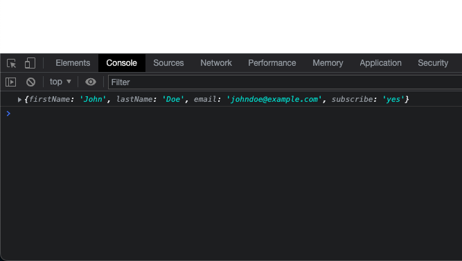
$ npm startAfter the form loads on your default browser you can now type a first name, last name, email and the option to subscribe to “yes” or “no”. Finally click the Submit button. It all should work like before – we see the data in our console.
Now to test when we enter invalid data: let’s delete our last name, or just enter a single character for a last name then click submit. You’ll notice nothing is displayed in the console. That means the validation worked! (I am assuming your are following the code from my previous post, but you can use your own submit handler and just put a console.log() call inside)
When the form validation fails the onFormSubmit handler is not triggered – which is what we want. In other words, the handling form function is not called when there is a validation error. We don’t want our user to submit invalid data to our back-end. Remember: even if we have a robust error handling on the client, it doesn’t mean we don’t have to validate the data on the back-end. We should always validate the data on the back-end – the good news is that we can save our validator schema on a separate file so we can reuse it on the back-end if you are using Node.js.
Before we finish, we have to fix the form look & feel so we don’t have to type on form fields in a single row at the top of the browser window. To fix that open App.css to add some basic styles:
.App {
  text-align: center;
  width: 40%;
  margin: 0 auto 0 auto;
}

.App form {
  margin-top: 2em;
  display: flex;
  flex-direction: column;
}

.field {
  display: flex;
  flex-direction: column;
  text-align: left;
  padding-top: 1em;
}

.field span,
.field.has-error label {
  color: red;
}

.field.has-error input,
.field.has-error select {
  border: 1px solid red;
}

.submit-btn {
  margin-top: 1em;
  text-align: center;
}

.field label {
  padding-right: 5px;
  font-weight: bold;
}

.field select {
  height: 1.2em;
  font-size: 14px;
}

.field label,
.field input,
.field select {
  width: 50%;
  height: 1.5em;
}
return (
<div className="App">
<form onSubmit={handleSubmit(onFormSubmit)}>
<div className="field">
<label>First Name</label>
<input {...register("firstName")} />
</div>
<div className="field">
<label>Last Name</label>
<input {...register("lastName")} />
</div>
<div className="field">
<label>Email</label>
<input {...register("email")} />
</div>
<div className="field">
<label>Subscribe</label>
<select {...register("subscribe")}>
<option value="yes">Yes</option>
<option value="no">No</option>
</select>
</div>
<div className="submit-btn">
<input type="submit" />
</div>
</form>
</div>
);I just applied basic CSS styes and wrapped each field inside a div with a class of field. That allowed each field and label to be grouped together.
Form Validation Errors
We have everything looking great in terms of the code, but our user doesn’t know what is happening. The user might say: “why is this button not working?” – when it is working. The real problem is that the form is not giving the user proper visibility of the react hook form errors with the data they entered.
For this part we are going to take advantage of the div with a class of “field”. We wrapped each input field inside this div, and we can also use it to display an error message when the user has not entered valid data on each field.
Lets go back to App.tsx and append an error message when there is incorrect input inside a given form field. We have several options on how to do this, but we are going to show the error message just below each form field and use a red outline around the form input field to tell the user they need to revise their input there.
With this plan on hand, let’s put it in action:
First we are going to get the errors from our formState property by exposing this variable from the useForm hook:
const { register, handleSubmit, formState: { errors } } = useForm<IFormInput>({
   resolver:yupResolver(schema),
});
Next we’ll display the form field error from each field, then adding it under the input or dropdown form field:
  return (
    <div className="App">
      <form onSubmit={handleSubmit(onFormSubmit)}>
        <div className="field">
          <label>First Name</label>
          <input {...register("firstName")} />
          <span>{errors.firstName?.message}</span>
        </div>
        <div className="field">
          <label>Last Name</label>
          <input {...register("lastName")} />
          <span>{errors.lastName?.message}</span>
        </div>
        <div className="field">
          <label>Email</label>
          <input {...register("email")} />
          <span>{errors.email?.message}</span>
        </div>
        <div className="field">
          <label>Subscribe</label>
          <select {...register("subscribe")}>
            <option value="yes">Yes</option>
            <option value="no">No</option>
          </select>
          <span>{errors.subscribe?.message}</span>
        </div>
        <div className="submit-btn">
          <input type="submit" />
        </div>
      </form>
    </div>
  );
Now let’s open our form (if you haven’t already):
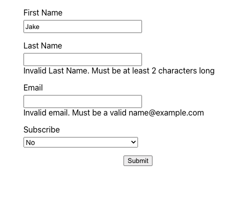
$ npm startLet’s clear the last name field and see what happens:
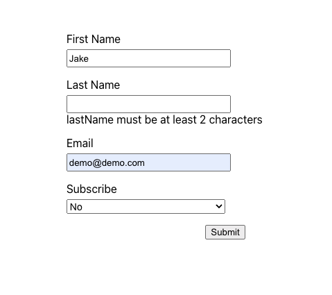
We now see the error message! great!
We are missing two items: the error message displayed in red, and an outline around the input field with the error also in red. But you may be saying: “can I customize the error message” – sure you can. Let’s do that before we do the other two items:
We’ll create a quick error hash with the names of the fields, and then access each by name. We’ll pass these errors inside the yup validators as parameters.
const errMsg = {
  firstNameErr: "Invalid First Name. Must be at least 2 characters long",
  lastNameErr: "Invalid Last Name. Must be at least 2 characters long",
  emailErr: "Invalid email. Must be a valid name@example.com",
  subscribe: 'You must select "yes" or "no"',
};

const schema: yup.ObjectSchema<IFormInput> = yup.object({
  firstName: yup.string().min(2, errMsg.firstNameErr).required(),
  lastName: yup.string().min(2, errMsg.lastNameErr).required(),
  email: yup.string().email(errMsg.emailErr).required(errMsg.emailErr),
  subscribe: yup.string<SubscriptionEnum>().defined(errMsg.subscribe),
});
  return (
    <div className="App">
      <form onSubmit={handleSubmit(onFormSubmit)}>
        <div className={`field ${hasError.firstName ? "has-error" : ""}`}>
          <label>First Name</label>
          <input {...register("firstName")} />
          <span>{errors.firstName?.message}</span>
        </div>
        <div className={`field ${hasError.lastName ? "has-error" : ""}`}>
          <label>Last Name</label>
          <input {...register("lastName")} />
          <span>{errors.lastName?.message}</span>
        </div>
        <div className={`field ${hasError.email ? "has-error" : ""}`}>
          <label>Email</label>
          <input {...register("email")} />
          <span>{errors.email?.message}</span>
        </div>
        <div className={`field ${hasError.subscribe ? "has-error" : ""}`}>
          <label>Subscribe</label>
          <select {...register("subscribe")}>
            <option value="yes">Yes</option>
            <option value="no">No</option>
          </select>
          <span>{errors.subscribe?.message}</span>
        </div>
        <div className="submit-btn">
          <input type="submit" />
        </div>
      </form>
    </div>
  );
We are simply appending a has-error class after the field class, only when a particular input field has an error. Let’s save and open our form:
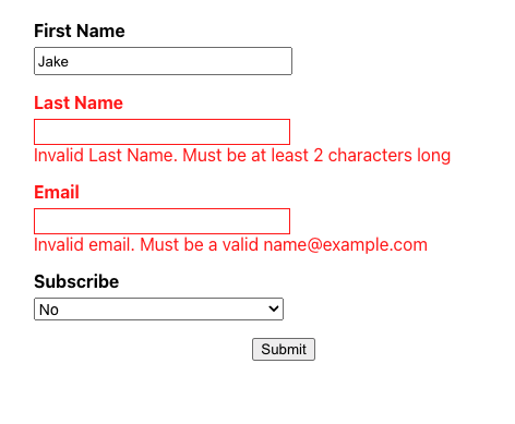
Great! we did it! We now have a robust form structure we can use for our forms. On a production application we should have a cleaner structure, like keeping our TypeScript types, schema validation, and error messages on separate files, but this is a good introduction to learning all the building blocks to creating react hook form rules or validation with create react app.
Conclusion
On this post we installed Yup and integrated an existing react hook form with our custom validation rules. While we did this, we ensured that our react hook form was properly connected with our schema validation code via the yupResolver and that each of our input fields’ TypeScript types were properly connected to these validation rules. Our React TypeScript setup is just getting better and better.
We then customized the error messages of each of the input fields, so our user knows any errors they made when typing on each field. We also made our form errors more accessible by giving them an attention calling red color to the label and input fields outline.
Hope you enjoyed this post as much as I enjoyed writing it. If you have comments, questions or any suggestions please share them below.